Tallinn 2035 development strategy
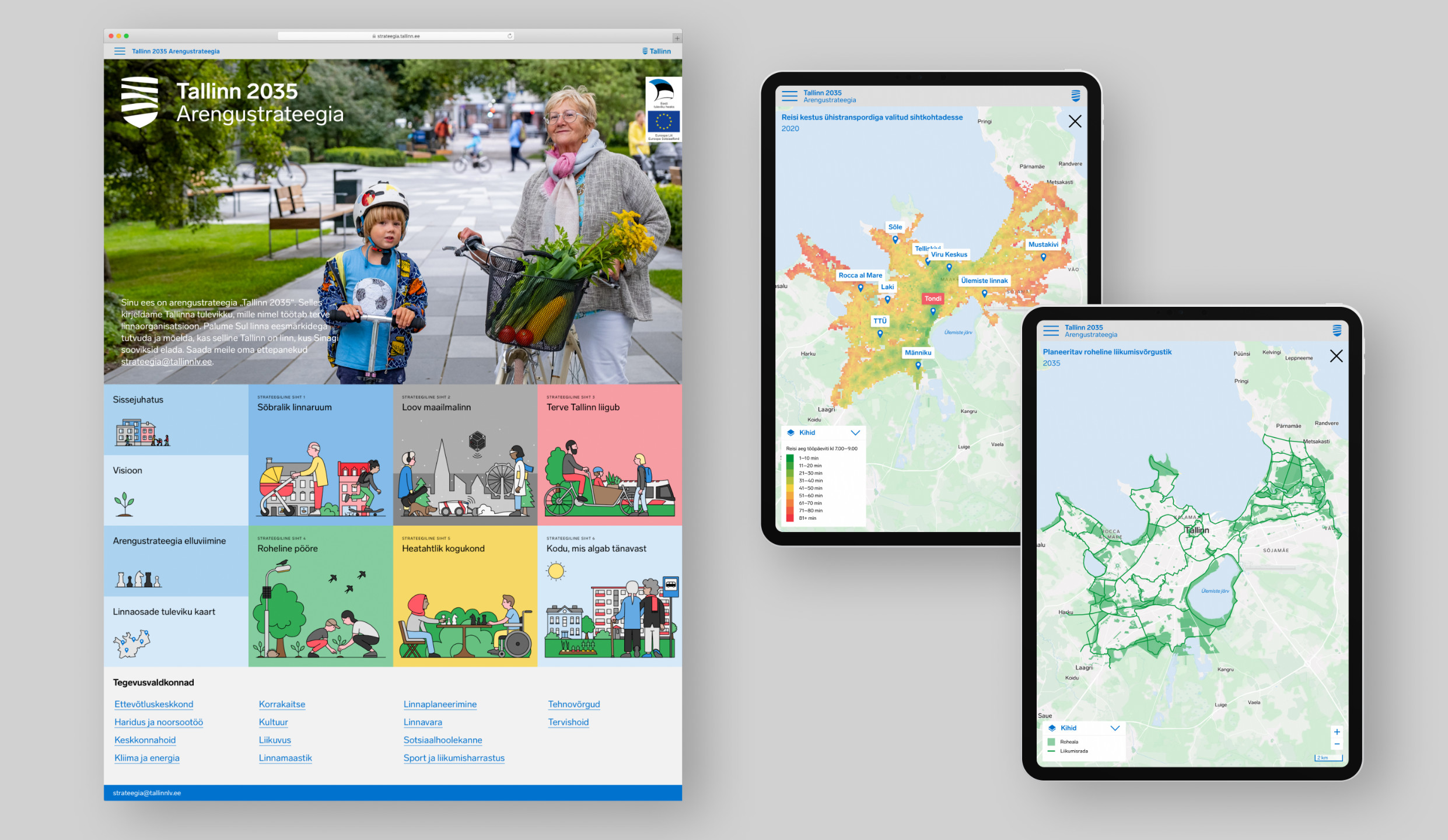
How to get a better 2035 for Tallinn? We designed the city strategy as an infographic story with a narrative data presentation accessible to all. Visualised progress indicators provide an Excel-free data overview, interactive maps add a sense of place, illustrations emphasize diversity. The additional content layer supports the city specialist in implementing the strategy.
The site can be accessed from any device, and supports different user interests and scenarios. For citizens – the visual and narrative presentation of the text, metrics and data makes it more tangible and accessible. For city officials and professionals implementing the strategy – there is an additional layer of content (‘read more’) on each main theme providing a deeper level of immersion.
The process of designing the website, assessing data and developing and visualising the metrics was carried out in parallel with the editing of the strategy texts. This made it possible to evaluate and test the amount of content graspable online. The strategy can be easily updated by city officials.
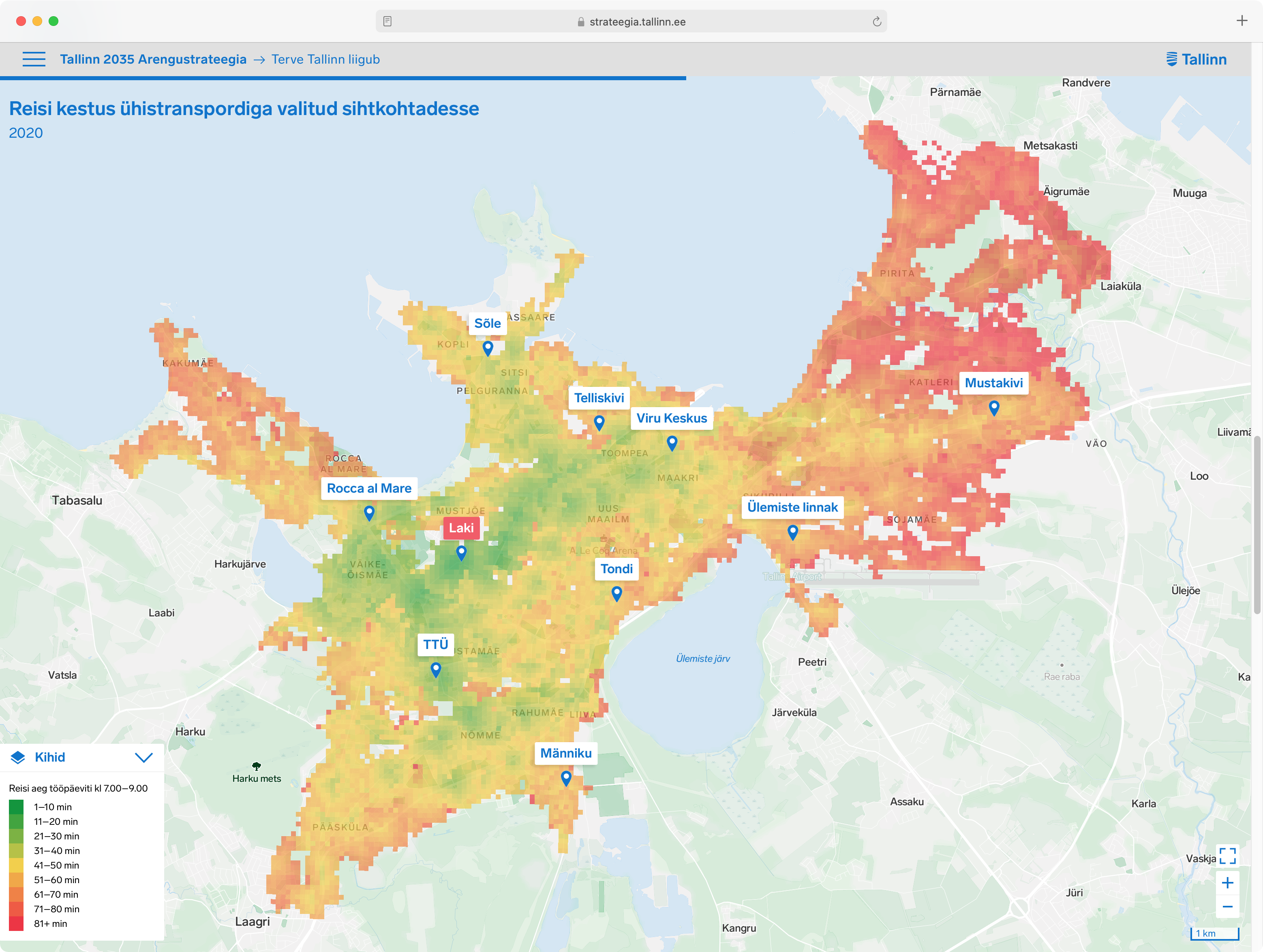
For broader monitoring of the city's development, strategic metrics were created based on a prior review of public, municipal and national data. For example, for the public transport accessibility measure (map "Duration of a trip to the destination of choice with public transport"), we looked at nine urban nodes and measured their centrality to all residents. For each square on the map, the time taken to reach the destination is measured at 5-minute intervals during the morning peak hour (7–8am), from which the average journey time to the destination is calculated.
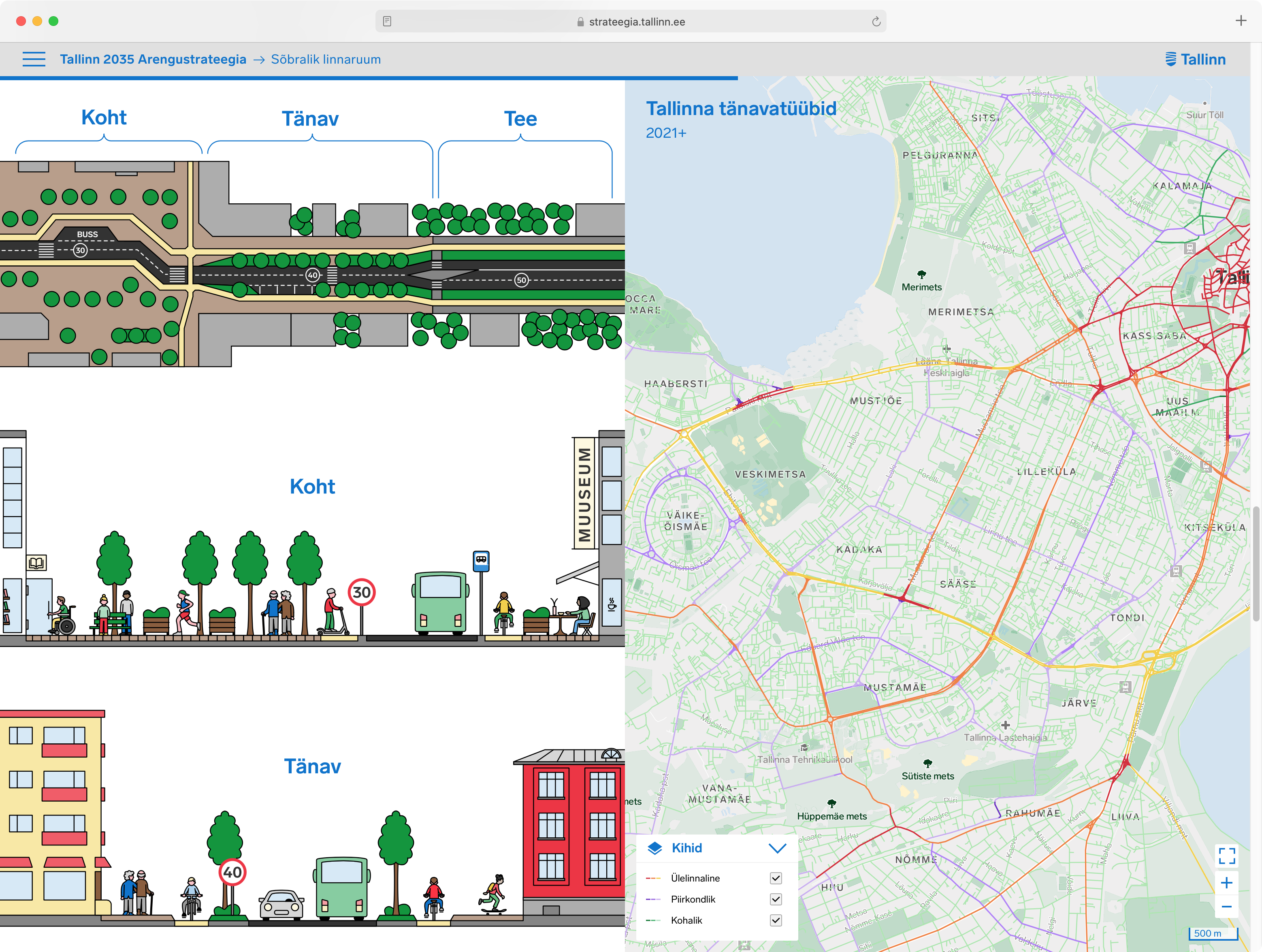
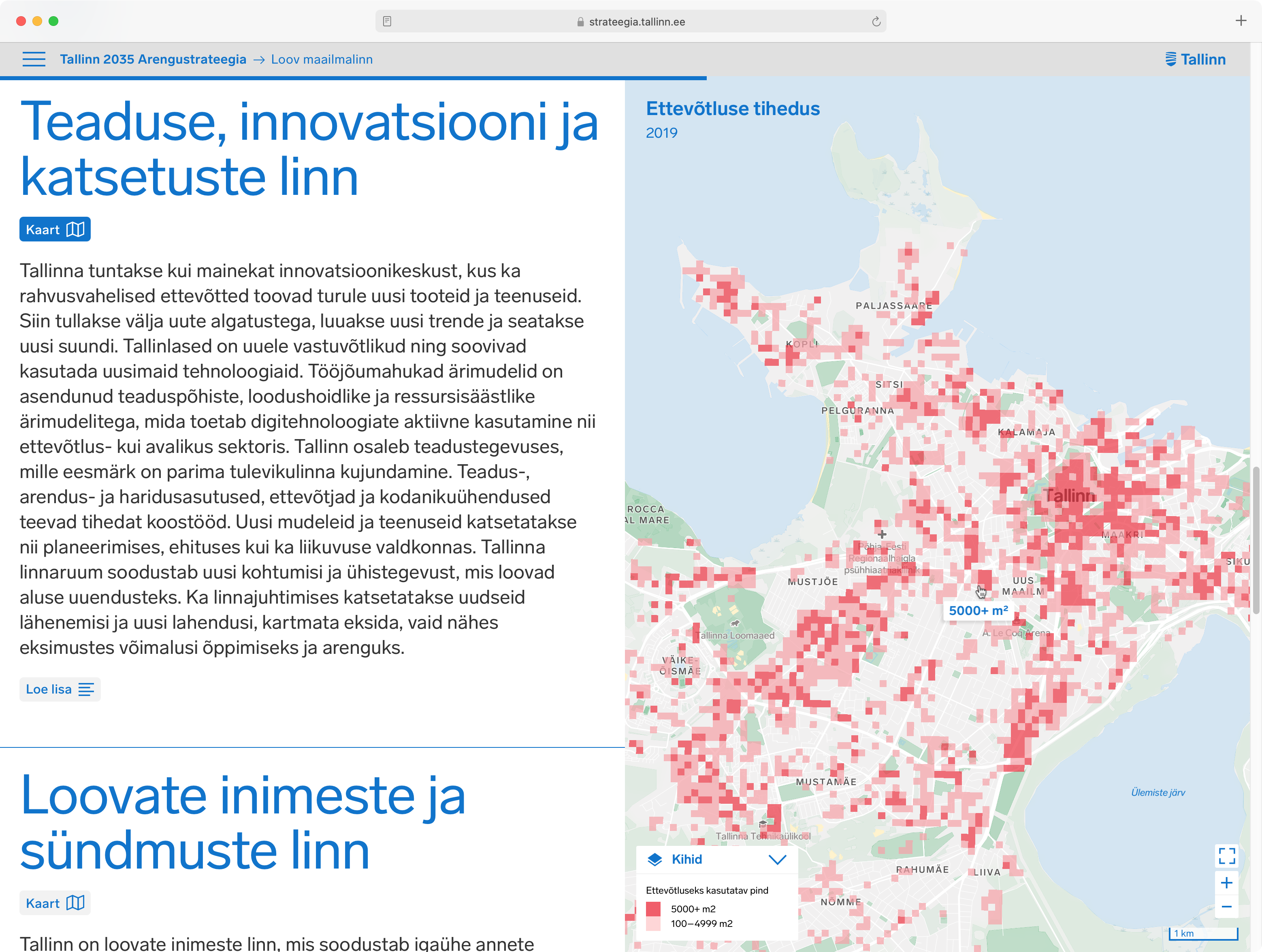
Each of the information layers (strategic metrics, maps, photos and illustrations) conveys the content of the development strategy from a different angle – maps add a local dimension to the text, illustrations emphasise the vision for social diversity; photographs link today's vision to the future, and visualised metrics provide a human-centred Excel-free view of the current state. For every metric a timeline is generated to show the progress that has been or is yet to be achieved by the city to give citizens a tool to observe.
Credits
Digital
Platvorm
Graphic design
Disainiosakond, Stuudio Stuudio
Urbanist
Inphysica
Client
Tallinn City Office
CVI
AKU, Ryan Chapman